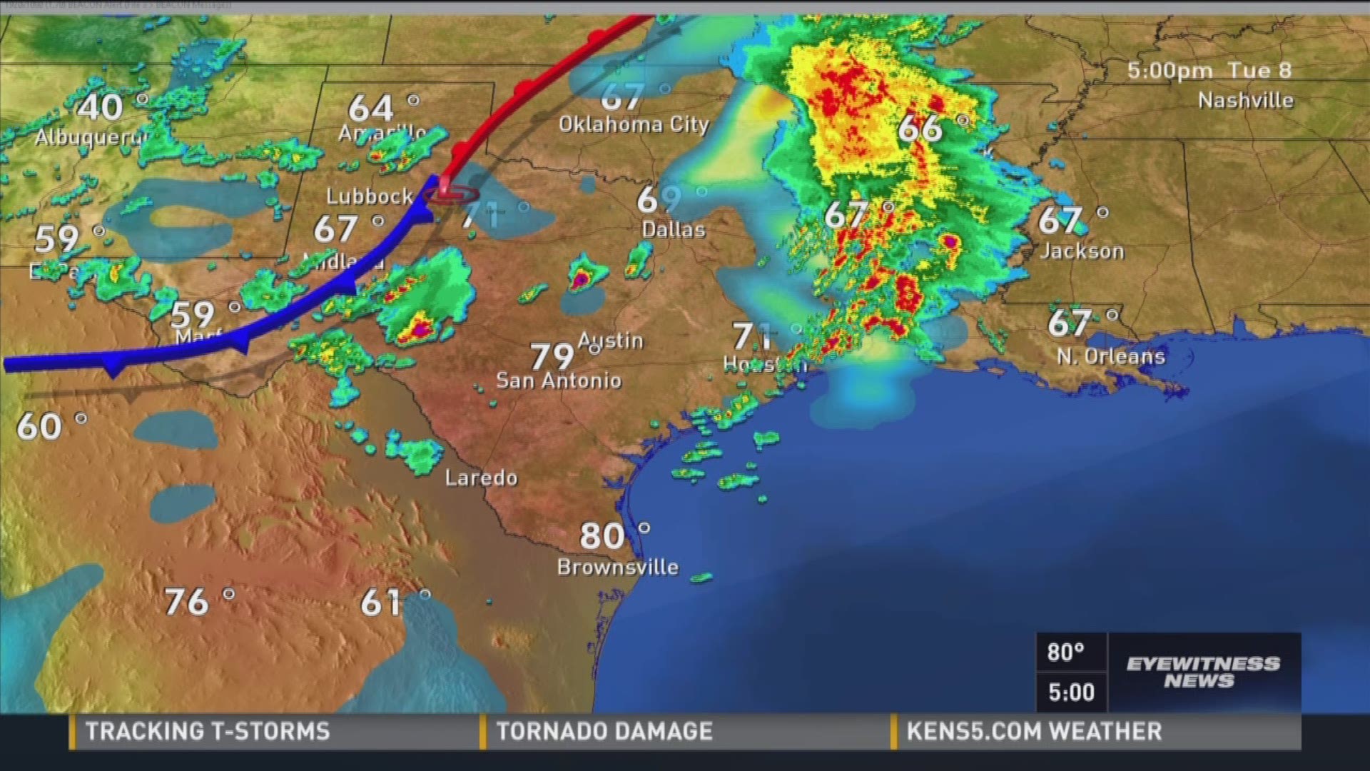
Lake Erie is a mood. If you live in Northeast Ohio, you know that the "partly cloudy" forecast on your phone is basically a polite suggestion, not a promise. When a massive squall lines up across the lake, everything changes in minutes. That’s why Cleveland live doppler radar isn’t just some techy tool for weather nerds; it’s the difference between getting home safely or being stuck on I-90 in a complete whiteout. Honestly, most people look at those colorful blobs on the screen and assume they’re seeing exactly what’s happening in their backyard right this second. They aren't.
Radar has lag. It has "blind spots." It has a weird habit of overshooting low-level snow.
Understanding how to read the actual data—not just the smoothed-out version on a free app—is how you actually survive a Cleveland winter (or a messy spring storm season). We are dealing with a very specific set of geographic challenges here. Between the "Snow Belt" dynamics and the way the radar beam travels from the terminal at Cleveland Hopkins, there’s a lot of nuance that gets lost in translation.
The Lake Effect Problem and Radar Limitations
Most people don't realize that the Cleveland live doppler radar data they see on local news or weather sites usually comes from the NEXRAD station (KCLE) located near Cleveland Hopkins International Airport. It’s part of a massive national network, but it has a specific weakness when it comes to Lake Erie.
Radar works by shooting a beam out into the atmosphere. That beam travels in a straight line. But the Earth is curved. By the time that beam reaches Geauga County or out toward Erie, Pennsylvania, it’s actually thousands of feet above the ground.
This is a massive problem for lake-effect snow.
Lake-effect clouds are notoriously "shallow." They sit low to the ground. Sometimes, the radar beam literally flies right over the top of the heaviest snow. You look at your phone, see a clear sky on the map, and then walk outside into a blizzard. It’s frustrating. It’s also why local meteorologists like Dick Goddard back in the day, or the current teams at WKYC and FOX 8, always emphasize "ground truth." If the radar says it’s clear but the observer in Chardon says it’s dumping two inches an hour, believe the observer.
👉 See also: How Much Did Trump Add to the National Debt Explained (Simply)
How Doppler Shift Actually Works (Without the Physics Lecture)
Think about a siren. As an ambulance drives toward you, the pitch goes up. As it moves away, the pitch drops. Doppler radar does the exact same thing with radio waves hitting raindrops or snowflakes.
By measuring that shift in frequency, the Cleveland live doppler radar can tell which way the wind is blowing inside a storm. This is how we get those crucial "velocity" maps. When you see bright green next to bright red on a velocity scan over Lorain or Parma, that’s rotation. That’s a possible tornado. In a region that gets hit by everything from derechos to waterspouts, knowing how to toggle from "reflectivity" (the colors of rain) to "velocity" (the wind) is a literal life-saver.
It’s not just about rain. It tracks bugs. It tracks birds. Sometimes, during massive migrations, the radar screen fills up with what looks like a giant storm, but it's actually thousands of birds taking off at once from the Cuyahoga Valley National Park.
The "False Echo" Trap
Have you ever seen a massive ring of rain suddenly appear around the Cleveland radar site on a clear day? It looks like a giant donut of doom.
That’s usually "ground clutter" or "anomalous propagation." Essentially, the radar beam gets bent back toward the ground because of a temperature inversion—common near the lake—and it starts hitting buildings, hills, or even the lake surface itself. The computer thinks it’s rain. It isn't. You can usually tell it’s fake because it doesn’t move. Real storms march across the map; ground clutter just sits there, shimmering.
If you’re using a high-quality tool like RadarScope or the National Weather Service’s enhanced radar portal, you can filter this stuff out. Most free apps don't bother. They just show you the raw, messy data, which leads to a lot of unnecessary panic in local Facebook groups.
✨ Don't miss: The Galveston Hurricane 1900 Orphanage Story Is More Tragic Than You Realized
Why You Should Stop Using Default Weather Apps
Your phone's built-in weather app is probably using "model data" mixed with a delayed radar feed. It’s smoothed out to look pretty. But when you’re trying to time a commute through the West Side Market area or heading to a Guardians game, "pretty" doesn't help.
You need the raw feed.
Serious weather watchers in Northeast Ohio use the National Weather Service (NWS) Cleveland office data directly. The NWS meteorologists are based in North Olmsted. They live and breathe this specific climate. They know that a storm moving over the warm lake water in October is going to behave very differently than a storm moving over frozen lake ice in February.
The Layers of Information
- Base Reflectivity: This is your standard "where is the rain" map.
- Composite Reflectivity: This shows the strongest echoes from all altitudes. It’s great for seeing hail.
- Storm Relative Velocity: This is the "is there a tornado" map.
- Correlation Coefficient: This is a newer tech that shows how "alike" the particles are. If the radar sees a bunch of stuff that isn't shaped like rain or snow, it’s probably debris. If you see a "debris ball" on the Cleveland live doppler radar during a severe warning, the tornado is already on the ground.
Real Examples of the "Cleveland Curveball"
Take the 2024 August tornadoes. We had multiple touchdowns across Northern Ohio. The radar was screaming. But because our terrain is relatively flat until you hit the Appalachian plateau to the south and east, those storms move incredibly fast.
If you were relying on a 5-minute delayed app, you were 5 miles behind the storm.
Then there's the "Lake Effect Machine." In late autumn, the water is still warm from summer. Cold Canadian air sweeps across the lake. It picks up moisture and heat, dumping it as massive bands of snow. These bands can be incredibly narrow. One street in Mentor gets two feet of snow; two miles away, the sun is shining. The Cleveland live doppler radar is the only way to track these narrow bands in real-time. If you see a dark blue or purple stripe staying stationary over your house for three hours, start shoveling.
🔗 Read more: Why the Air France Crash Toronto Miracle Still Changes How We Fly
Making Sense of the Colors
Standard radar uses a color scale. Light green is a drizzle. Yellow is a solid rain. Red is a heavy downpour.
But when it turns pink or white? That’s where things get dicey. In the summer, that usually means hail. The ice reflects the radar beam much more strongly than water does. In the winter, it can indicate a transition zone—the dreaded "wintery mix."
When you see a line of pink cutting through Cuyahoga County, that’s usually the "melting layer." It’s where snow is turning into sleet or freezing rain. That’s the most dangerous time to be on the roads. It’s not the snow that kills; it’s the invisible ice layer that the radar identifies as a specific "dual-pol" signature.
Actionable Steps for Tracking Cleveland Weather
Stop settling for the "sunny" icon on your home screen. If you want to actually know what's coming, follow these steps:
- Bookmark the NWS Cleveland Radar: Go directly to the source. The National Weather Service website provides the most accurate, un-manipulated data from the KCLE station.
- Watch the Loop, Not the Static Image: A single frame tells you nothing. You need to see the trend. Is the storm intensifying? Is it bowing out (a sign of high winds)? Is it shifting north?
- Check the "Last Updated" Timestamp: Radar isn't instantaneous. There’s a delay of a few minutes while the dish completes its rotation. If the timestamp is more than 6-10 minutes old, the storm has already moved several miles.
- Learn to identify "The Hook": During severe summer storms, look for a hook-like shape on the bottom-right of a storm cell. That’s the classic sign of a rotating updraft.
- Trust the SPC: The Storm Prediction Center isn't based in Cleveland, but they issue the "Watches." If they put Northeast Ohio in a "Slight" or "Enhanced" risk category, have your Cleveland live doppler radar app open and ready.
Cleveland weather is a beast, but it’s a predictable one if you have the right eyes. We don't just live with the lake; we live by its rules. Next time the sky turns that weird shade of greenish-gray over Lake Erie, don't wait for the notification on your phone. Open the live feed, check the velocity, and see for yourself which way the wind is actually blowing. Knowledge is the only thing that keeps you dry—or at least gives you enough time to find your umbrella.